
Words aren’t the only things that can get lost in translation. Images and visual elements greatly impact how your brand message comes across in different countries, which is why multilingual graphic design is an essential part of global marketing.
Keep reading to learn about the importance and complexity of multilingual design. Including key examples from big-name brands and insights from one of VeraContent’s graphic designers.
See also: How to set up a design workflow for global social media accounts
What is multilingual graphic design?
Multilingual graphic design is the process of creating graphics in more than one language. This creative process involves translating any text overlaid on images and redesigning the layout to suit the copy in different languages—including adjusting font sizes, alignment and text placement.
In addition to reworking the translated text, multilingual graphic design also calls for localization.
When creating graphics in multiple languages, you need to adapt each image to suit cultural preferences and make sure they’re both appropriate and relatable to each target audience. This process involves everything from choosing the best colors to the using relevant visual references.
Mindfully adapting your marketing graphics ensures that your brand remains sensitive and appreciates cultural nuances.

Why is multilingual graphic design different from standard graphic design?
A Swedish Instagram post for food app, Foodora, asking Swedish users to find five Valborg—a traditional spring festivity in Sweden—words in the picture to win 20% off their next purchase.
In short: Multilingual graphic designs cater to multiple languages and cultures, while standard graphic design purely focuses on one language and one audience.
Multilingual graphic designers need to deal with varying text length, bilingual design file names, font resolution and right-to-left formatting for languages like Arabic and Hebrew. Then there’s considering multilingual fonts (more on this later) and ensuring that all images used are relevant for each target audience.
As you can see, it’s quite a bit more complicated than designing in just one language!
Without considering specific multilingual design concepts, the visual impact of your content can easily get lost or completely misinterpreted.
See also: Marketing translation: Engaging audiences in their own language
Graphic design concepts for multilingual marketing
When designing graphics in multiple languages, here are a few things for designers to consider:
1. Leave a lot of open space
Text lengths vary in different languages, which can be challenging when it comes to laying out your design.
We’ve found this particularly tricky when creating the Turkish version of the content for one of our clients. When designing graphic templates, graphic designer Esaú Gozalo ensures that the designs would look good with either one or two lines of text.
“Multilingual or not, a design should always breathe. And when designing for different languages, leaving enough room for text is even more important. The key is to leave a lot of space for the text and avoid cramming the design with many elements.”
Tip: Add an extra line of text the first time you design a template to prepare it for varying text lengths. Writers and translators should also try to keep the text on images as brief as possible.
See below examples of differing campaign logo designs used on Visa’s Spanish vs. UK Instagram accounts:

Catering to varying word lengths when adapting to different languages can also impact development on apps and websites. For example, the Deliveroo app has a 16-character limit for filter titles such as “Grocery” or “Chinese food,” which can make adaptation to different languages challenging. Here’s how they handle word count restrictions:
“What we tend to do is ask the designers or the engineers: ‘What is it that you want to say?’ Not the actual transcript, but what is the core message? And we’ll find a completely different way of saying it that fits that character limit.”
– Anne-Sophie Delafosse, localization manager at Deliveroo
2. Use regionally & culturally appropriate images
From the people represented in your designs to the references used, it’s important to use culturally appropriate and relevant images.
As Esaú puts it:
“If you’re using images, emojis or symbols in your design, you need to ask yourself if their meaning will hold in different cultures. When localizing content, it might make sense to completely change the media for one country from time to time, but normally you’ll want to choose imagery that caters to multiple cultures.”
Secondly, the images must be regionally relevant so that local audiences can relate to the content.
See also: How to post in multiple languages on Facebook and Instagram
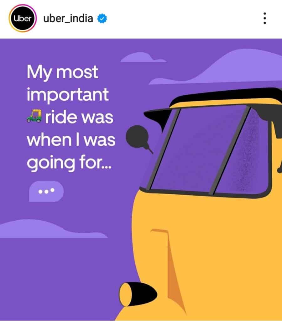
See below two examples of Uber using regionally appropriate images on Instagram posts: An image of a Tuk Tuk for their India account (left) and the Sydney Harbour Bridge for their Australia account (right).

3. Consider different color associations
While using culturally appropriate images may come as second nature to most graphic designers, adapting colors for different regions takes a bit more getting used to. It’s important to understand how color associations vary from culture to culture and within different possible audiences.
Color associations within North American culture can often mean something radically different to Japanese or Middle Eastern audiences, where color meanings are more specific and defined.
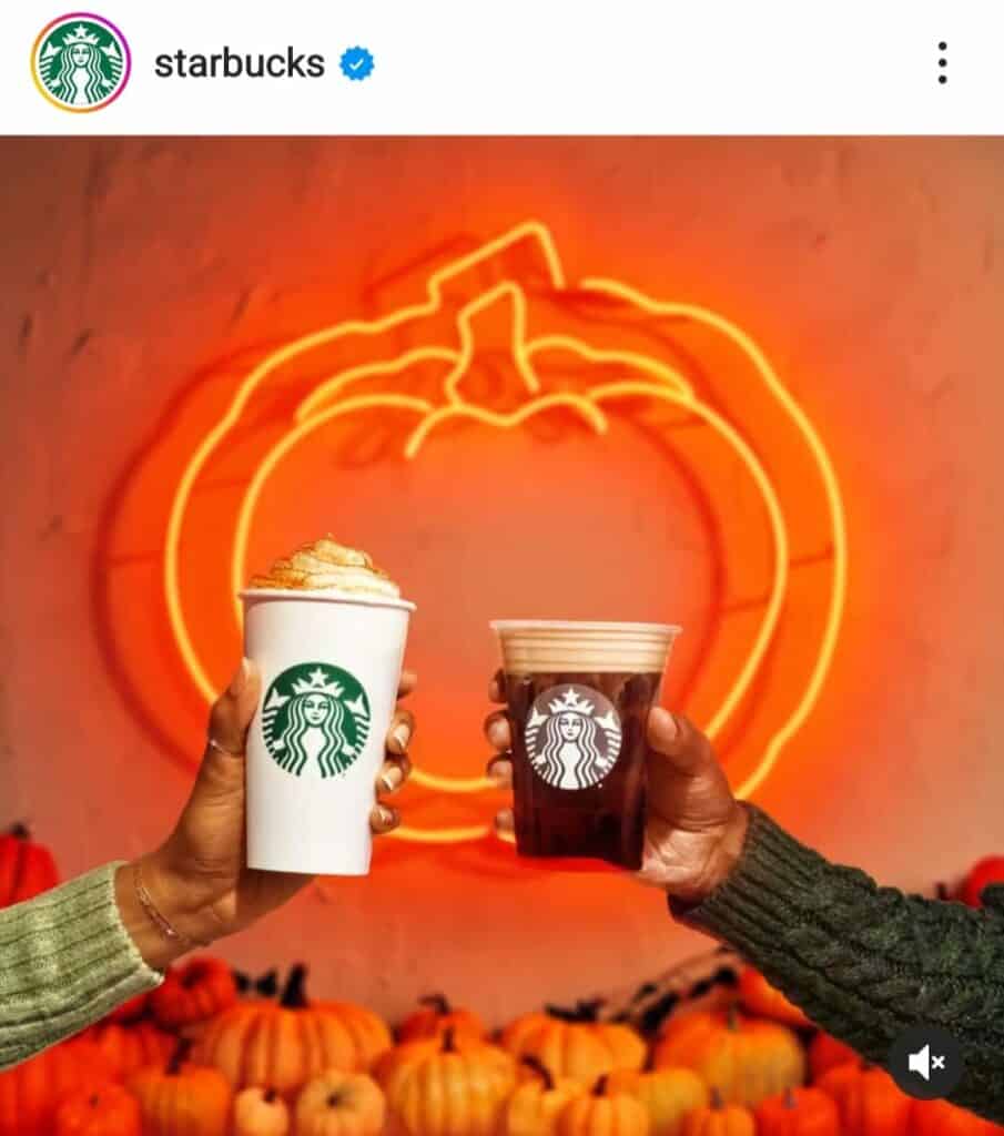
For example, in the US, orange is the color of autumn and harvest. It’s usually used to signify the start of fall through Halloween and Thanksgiving. However, in the Netherlands, it’s considered the national color and most commonly used to signify royalty.
See below an example of an autumn-themed Instagram post on Starbucks’ US account:
4. Think about text direction & alignment
Alignment plays a major role in all types of graphic design, as it tightens your designs and helps them look clean and organized. But it also differs for certain languages.
In Arabic, Hebrew and Persian, text is written from right to left. This might mean you need to reverse the entire layout of your image if it was initially designed for languages reading from left to right.
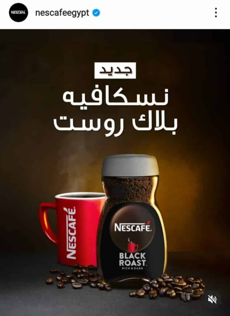
Tip: When creating graphic design templates that need to cater to both left- and right-aligned languages, try center-alignment as a middle ground alternative.
Here’s an example of an image used on Nescafe Egypt’s Instagram account using center-alignment on Arabic text.
5. Get help when you need it
Graphic designers should have close communication with the entire creative team—including writers, project managers and translators—to discuss challenges when they come up.
As Esaú points out:
“There may be times where the text just doesn’t fit, and you’ll have to ask someone to find a shorter way to say the same thing. Or you may be working with a language where grammar works very differently, and you’ll need extra guidance to make sure the layout looks and reads right.”
It’s also useful to have processes that allow linguists to review the final design in their language and ensure it’s effectively localized. If your creative team is made up of a combination of in-house staff and freelance designers or writers, make sure that your review process still includes all members.
Quality assurance is so important in the multilingual graphic design process!
See also: Content localization: A how-to guide for global brands
Multilingual typography: Fonts designers need to know
Certain languages have unique special characters—like the “å” in Swedish word “blåsa”, the “ž” in Croatian word “džentlmen” and the “œ” in French word “œuvre”—and not all typographies feature them. That’s why it’s important to choose a font family that supports all the languages you’ll be working with.
As a first step, make a list of all the languages that the font family needs to support and make sure you choose a multilingual font family that fits those requirements.
Picking a font is all about reaching a balance—as a designer, you’ll want to find a font that visually conveys the character and tone of the brand. But the more languages you need to cover, the fewer choices you’ll have.
According to Esaú: “The best chance to find the right font is to buy a typeface from a professional foundry as they tend to support more characters than free font makers.”
Pro tip: There’s an exceptionally good free multilingual font from Google called Noto, covering more than a hundred writing systems.
See also: How to create a solid multilingual social media strategy
Fun fact: While the name “Noto” means “I write, I mark, I note” in Latin, it’s also short for “no tofu” as the project aims to eliminate what is sometimes referred to as “tofu rectangles”—when symbols like this □□ are shown when no font is available for your text.
Beyond social media: Graphic design for diverse content types
Graphic translation and multilingual design extend far beyond social media graphics, also impacting materials like product manuals, training guides and in-store signage. When creating these content types for global audiences, designers need to carefully consider not only language but also layout, cultural relevance and clarity.
For example, a product manual must communicate effectively across languages, maintaining a clean design that accommodates different text lengths while prioritizing readability and universal symbols.
Incorporating multilingual design into product packaging is equally crucial. For example, adapting layouts to meet legal requirements for health warnings in multiple regions or tailoring color schemes to resonate with local preferences can ensure your product appeals broadly while respecting local nuances.
Ultimately, high-quality graphic translation in these materials reinforces brand consistency across all touchpoints, helping to engage and inform customers around the world effectively.
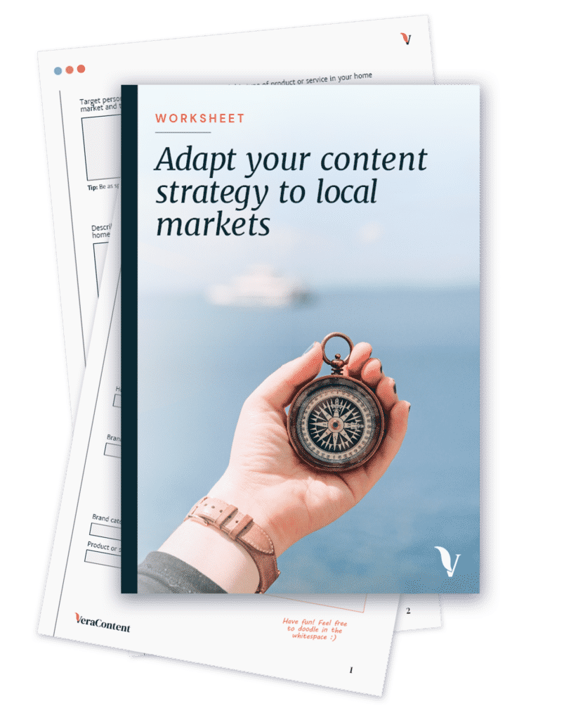
Download our worksheet to help you adapt your content strategy for local markets:
Hire a specialist multilingual graphic design agency
Multilingual graphic design doesn’t happen in a silo. Before the design process can start, marketing strategists, copywriters and translators have already been involved, not to mention project managers overseeing the whole process.
If you want your brand to continue sharing its message via images in multiple languages, it pays to hire a specialist in multilingual design. At VeraContent, we regularly do graphic design localization to complement our written work for clients and their audiences worldwide. Get in touch with us to find out more about our graphic design services—you can also view samples of our graphic design work here.
Book a call to find out if you qualify for a Free Content Consultation.